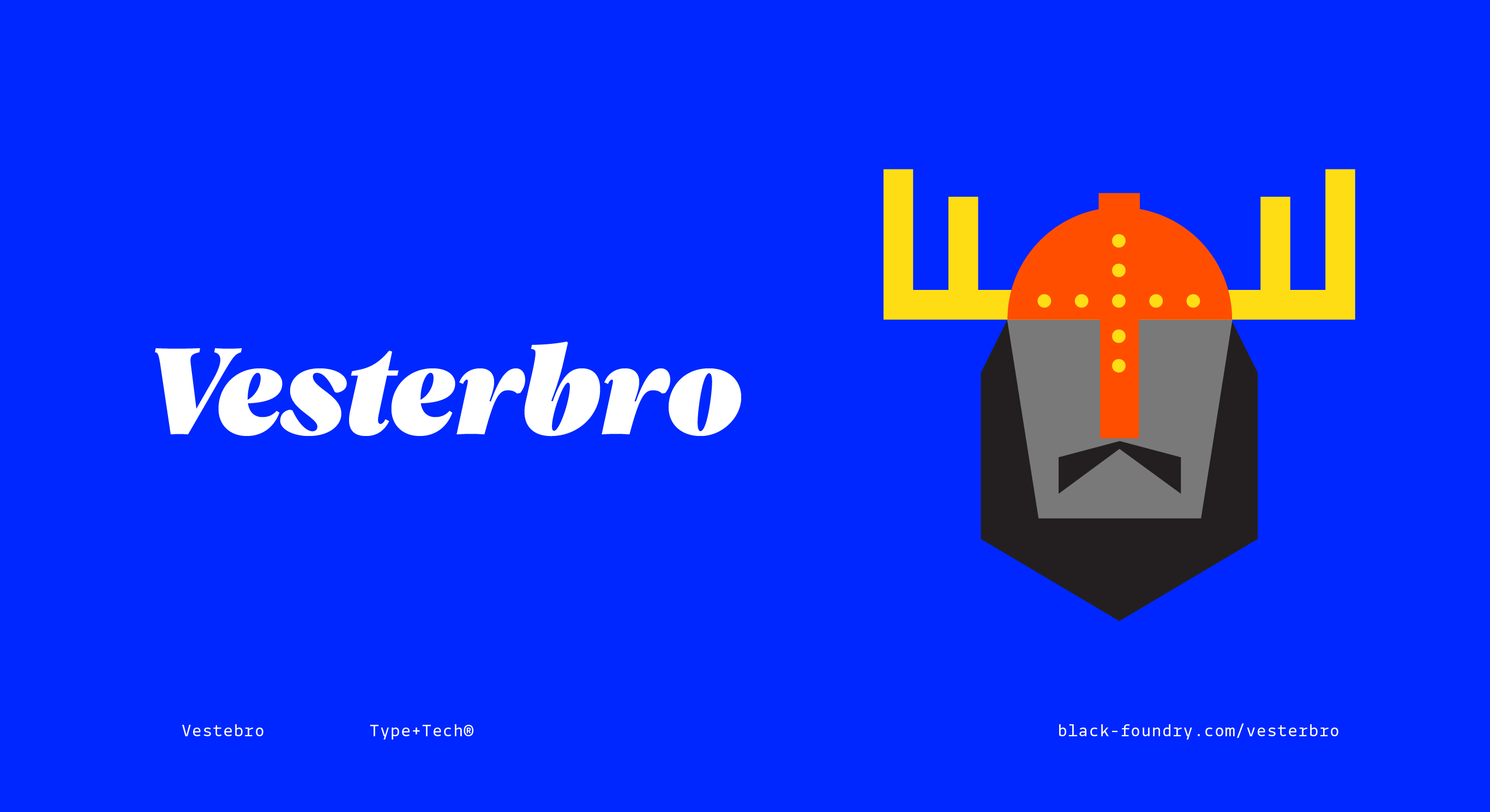
Vesterbro
Type design & Visual identity
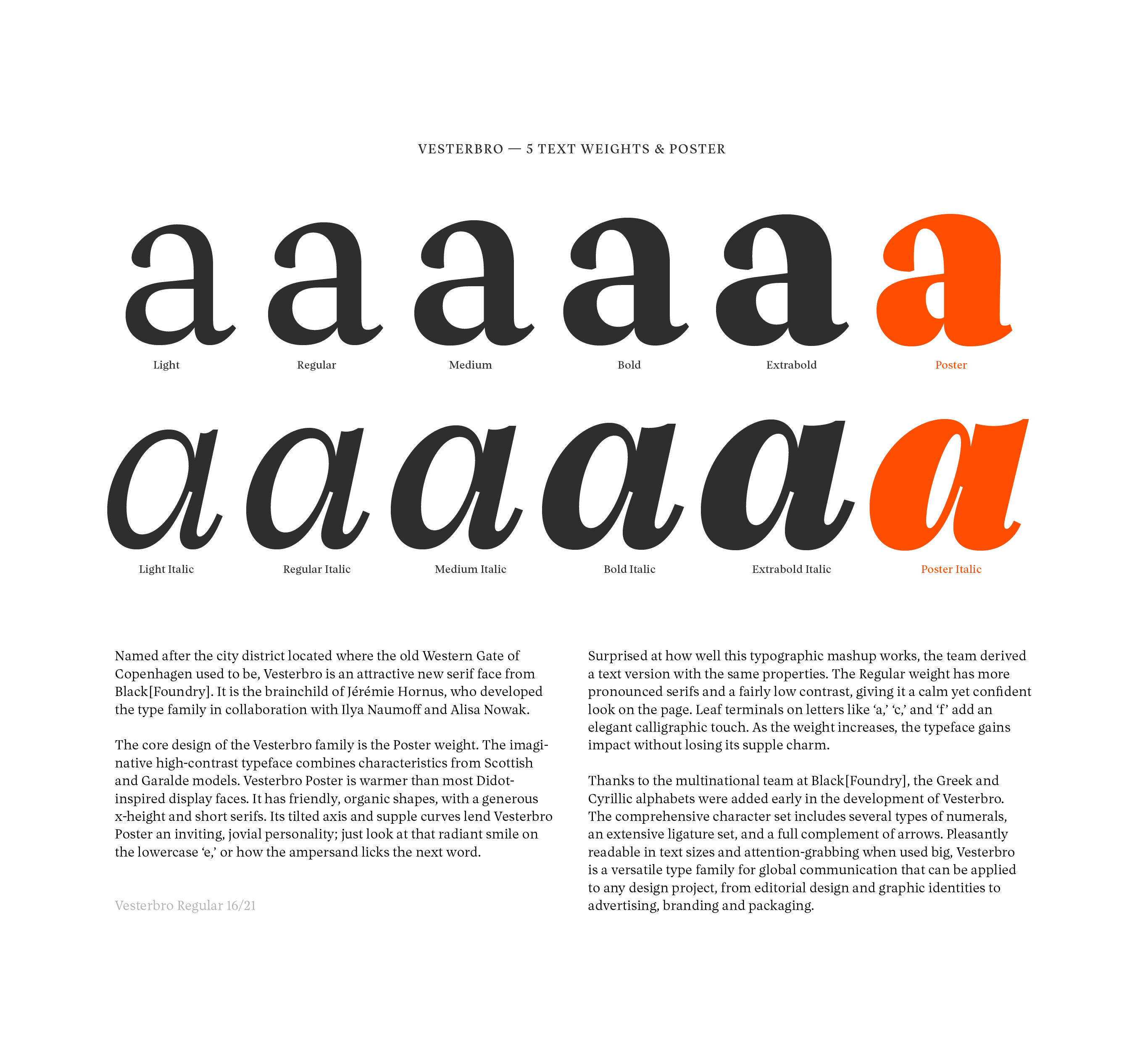
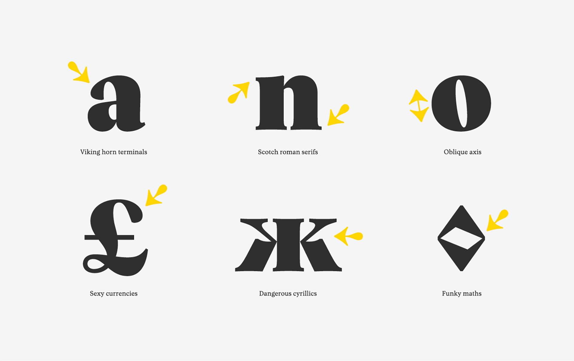
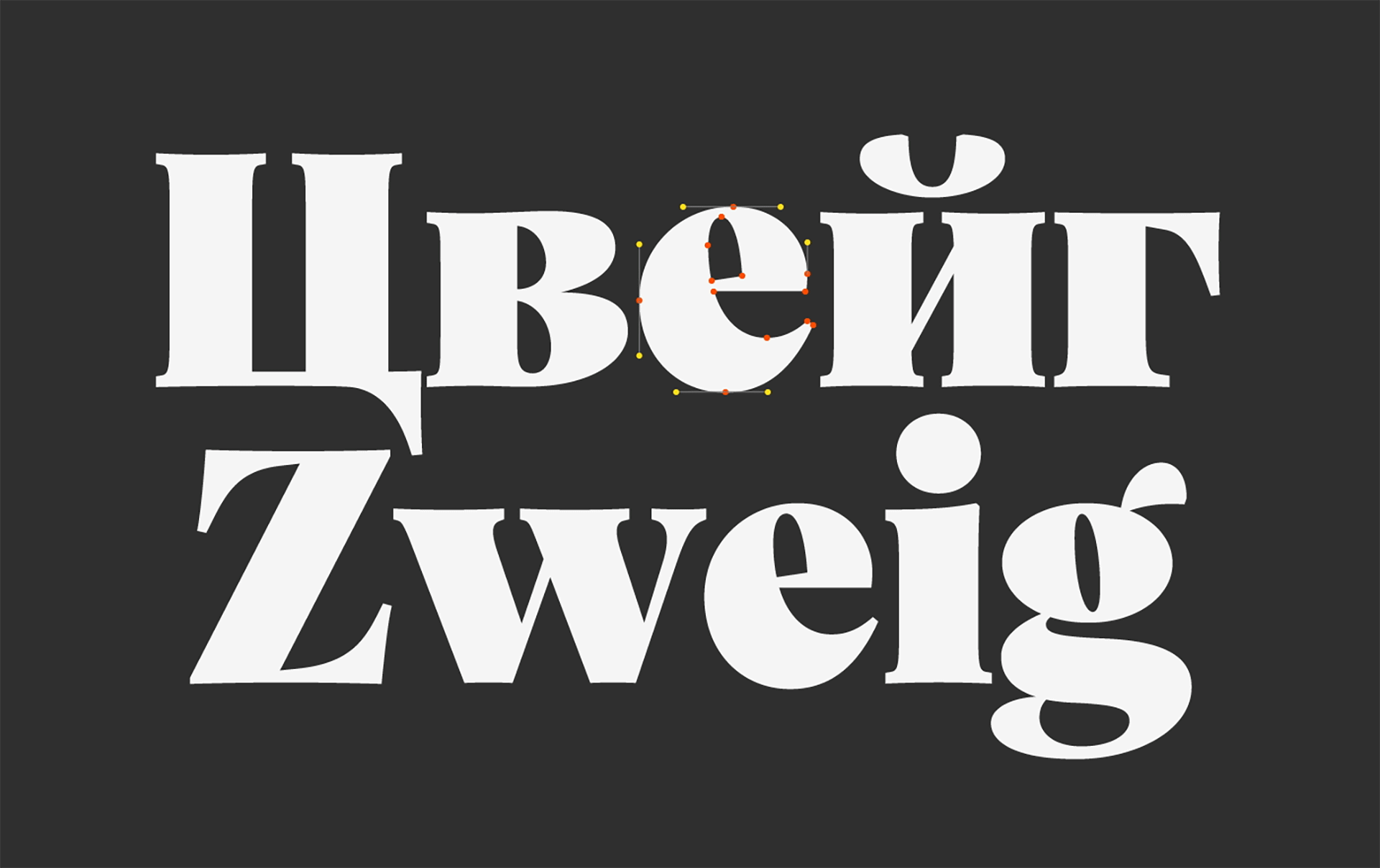
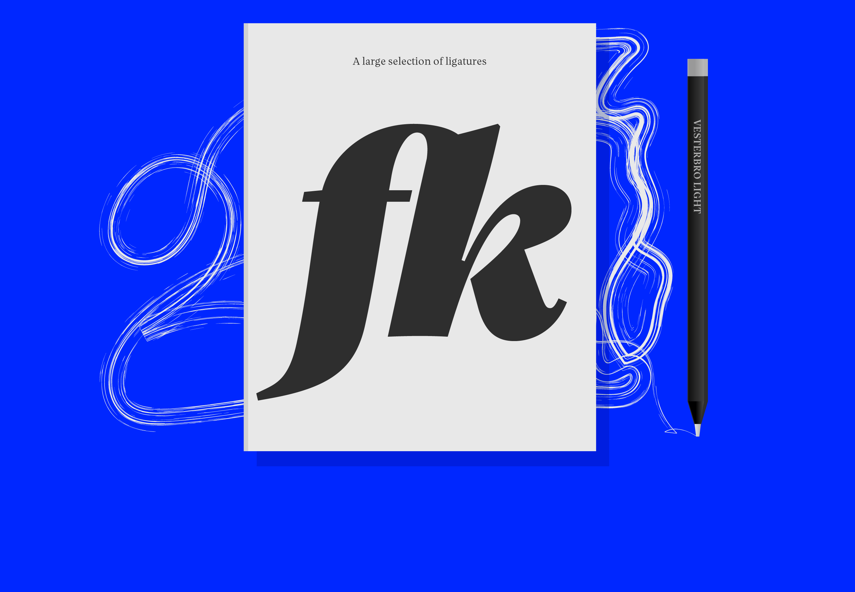
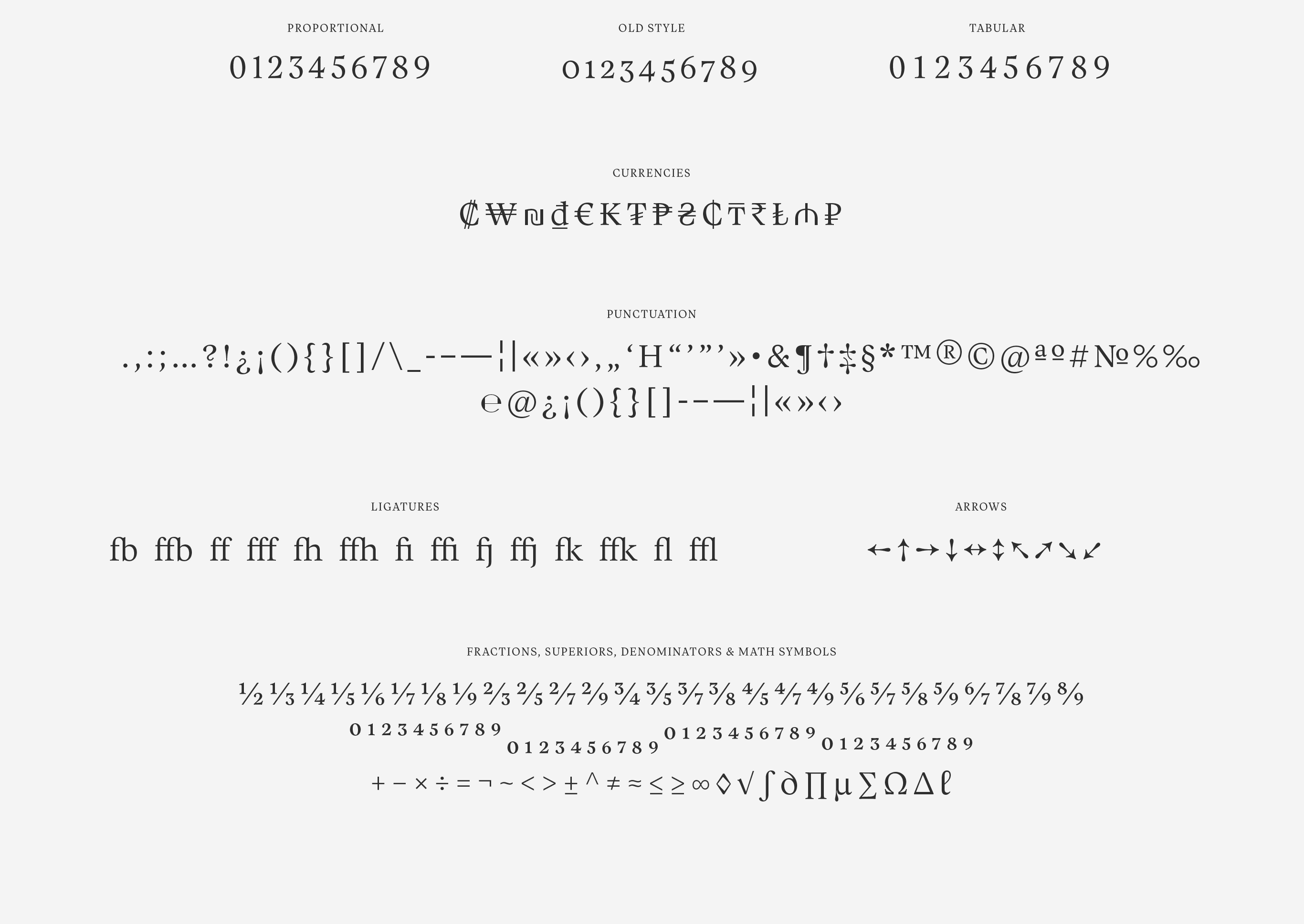
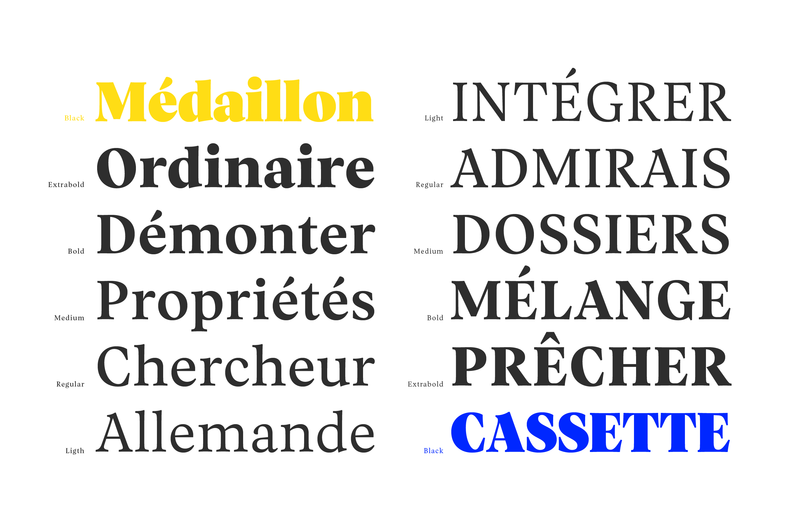
Vesterbro is a font family initially imagined by Jeremie Hornus and named after a city district of Copenhagen, located where the old Western Gate used to be. Today Vesterbro is a modern serif face that grew into a large family including Italics, 3 scripts and 6 weights. Together with Jeremie and Alisa we first developed the Romans, designing the Latin and Cyrillic scripts in parallel and making sure they work perfectly together. We later developed the Italics and added a Greek script to the family.
For the release of the font I designed a visual identity and website. The identity stems from the Danish inspiration for the typeface with the vikings and primary colors at its heart. The 2017 release was a great success — Vesterbro winning several prizes and being blogged about all around the world.
Available here